Boost to your brand by enhancing your customer base, expanding your outreach, and increasing your influence. We believe in keeping the creative process enjoyable, and that's why we bring cookies to meetings.
Featured articles

Things to Do
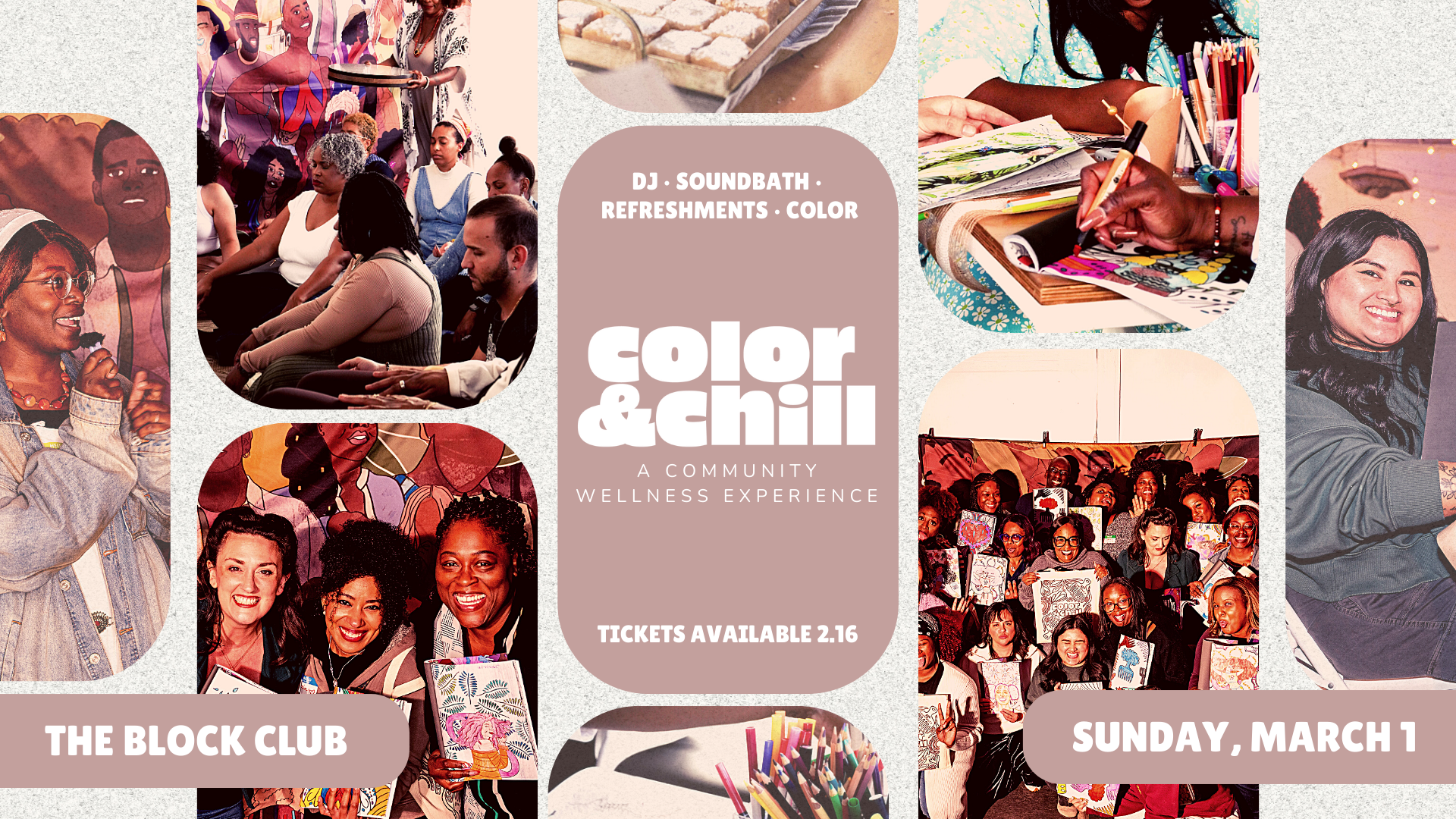
18 Things to Do in San Diego This W...

Guides
8 of the Weirdest Moments in San D...
Things to Do
How to Estate Sale Like a Pro
Featured articles
Things to Do
18 Things to Do in San Diego This W...
Things to Do
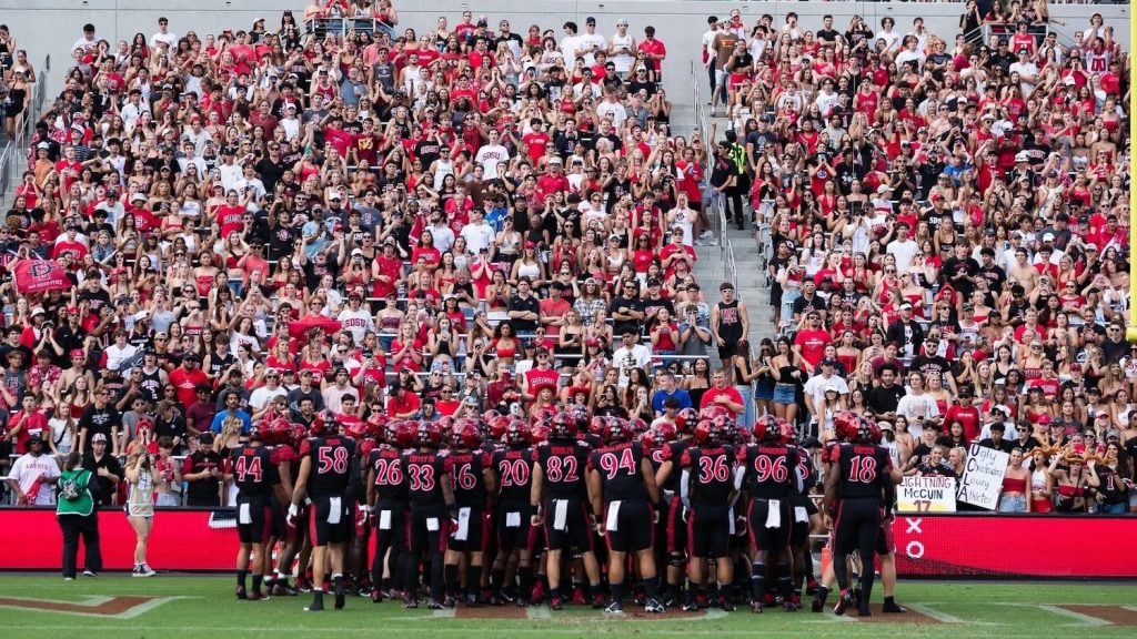
5 San Diego Sports Events to Watch ...

Things to Do
Where to Celebrate the Fourth of Ju...
Featured articles
Things to Do
18 Things to Do in San Diego This W...
Things to Do
5 San Diego Sports Events to Watch ...
Guides